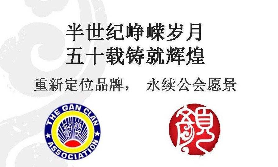
The Launch of New Logo
The logo resembles a Zhuan Ti seal. Zhuan Ti, one of the ancient styles of Chinese calligraphy that began in the Qin Dynasty. The character of Zhuan Ti being solemn and steady, pure and simple is in line with Gan as one of the noble surnames.
The exterior of the seal represents commitment, which signifies the Gan descendants carrying forward the sage teachings of their forefathers, and reflects the deep historical and cultural background of the Gan.
The Gan character adopts the shape of the clouds in its writing of the three strokes at the lower left to bring out an oriental flavour. At the same time, clouds being the symbol of wealth and good fortune in the East over thousands of years, expresses Gan as a characteristics of the distinguished surname, as well as the embodiment of blessings to the Gan descendants.
Its round shaped represents the harmony of Gan Clan, showing that the Gan members are gathered in unison to carry on the clan’s spirit.
The logo uses crimson colour in a gradual tone as though the rising sun releasing its rays, to reflect the vitality and vigour of the development of the Gan Clan.


